I've a web page with three tabs. I want the last tab to fade partially on it's right when screen size is <= 640px. My SCSS was doing that, but the styles aren't applying after moving folders. Right now, it only fades the content within it. I want the last tab to fade 30% on it's right.
I tried using blur and gradient, which applies only on the text but not the tab's outline.
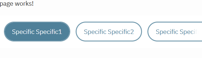
Trial 1: current visual
```
@import '../../../styles/variables';

.tabs {
    list-style-type: none;
    padding: 0;
    display: flex;
    background-color: $universal-white-color;
    border-radius: 30px;
    overflow: hidden;
}

.tabs li {
    position: relative;
    padding-left: 30px;
    padding-right: 30px;
    padding-top: 10px;
    padding-bottom: 10px;
    height: 40px;
    margin: 1rem;
    color: $primary;
    text-align: center;
    display: flex;
    align-items: center;
    justify-content: center;
    border-radius: 30px;
    outline: 2px solid $primary-border-color;
    cursor: pointer;
    transition: background-color 0.3s ease;
    opacity: 1;
    flex: 1;
    white-space: nowrap;

    @media (max-width: 1024px) {
        margin-left: 10px;
    }

    @media (max-width: 768px) {
        margin: 0.5rem;
        padding: 10px 30px;
    }

    @media (max-width: 640px) {
        margin: 1rem;
        margin-left: 0;
        padding: 10px 25px;
    }
}

@media (max-width: 640px) {
    .tabs li:first-child {
        margin-left: 10%;
    }

    .tabs li:last-child::after {
        content: '';
        position: absolute;
        top: -10%;
        right: 0;
        bottom: -10%;
        width: 30%;
        background: $universal-white-color;
        filter: blur(4px);
        z-index: 1;
    }
}

.tabs li.active {
    background-color: $primary;
    color: $universal-white-color;
}

.tab:not(.active) {
    background-color: $universal-white-color;
    color: $primary;
}

.tabs li:hover {
    background-color: $primary-hover-color;
    color: $primary;
}

```
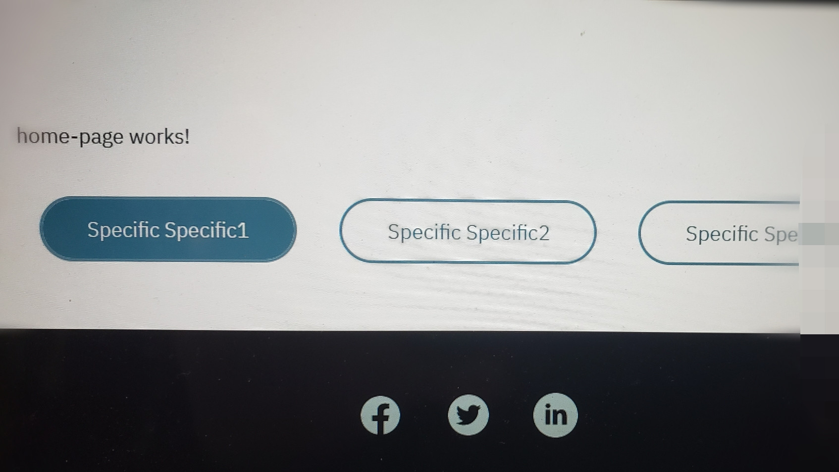
What I'm trying to achieve looks somewhat like this: edited as photo to blur 30% of the right of the last tab

It may help