I'm working on creating a responsive grid layout using CSS Grid, where I have a series of grid items displayed in a grid container. I'm using grid-template-columns: repeat(3, minmax(100px, 1fr)); to automatically adjust the number of columns based on available space. Additionally, I have a specific grid item (the third one) that spans multiple columns using grid-column-start: span 2; and grid-column-end: span 3;.
However, in the layout, the third grid item leaves empty space in the grid where it spans. I want to fill this empty space with content or additional grid items. How can I achieve this using CSS Grid?
Here's a simplified version of my HTML and CSS:
.grid-container {
  display: grid;
  grid-template-columns: repeat(3, minmax(100px, 1fr));
  grid-gap: 20px;
}

.grid-item {
  background-color: #f0f0f0;
  border: 1px solid #ccc;
  padding: 20px;
  text-align: center;
}

.grid-item:nth-child(3) {
  grid-column-start: span 2;
  grid-column-end: span 3;
}
<div class="grid-container">
<div class="grid-item">1</div>
<div class="grid-item">2</div>
<div class="grid-item">3</div>
<div class="grid-item">4</div>
<div class="grid-item">5</div>
<div class="grid-item">6</div>
<div class="grid-item">7</div>
<div class="grid-item">8</div>
</div>I tried adjusting the CSS properties for the grid layout, such as grid-auto-columns, to see if they would automatically fill the empty space created by the third grid item. However, these properties didn't achieve the desired result.
My expectation was to find a solution within CSS Grid itself that would dynamically fill the empty space with content or additional grid items, ensuring a visually balanced layout. like this image: 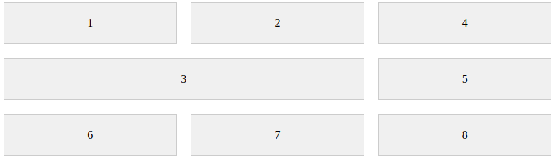

Add
grid-auto-flow: dense