I am trying to build a responsive design,But encounter this problem:
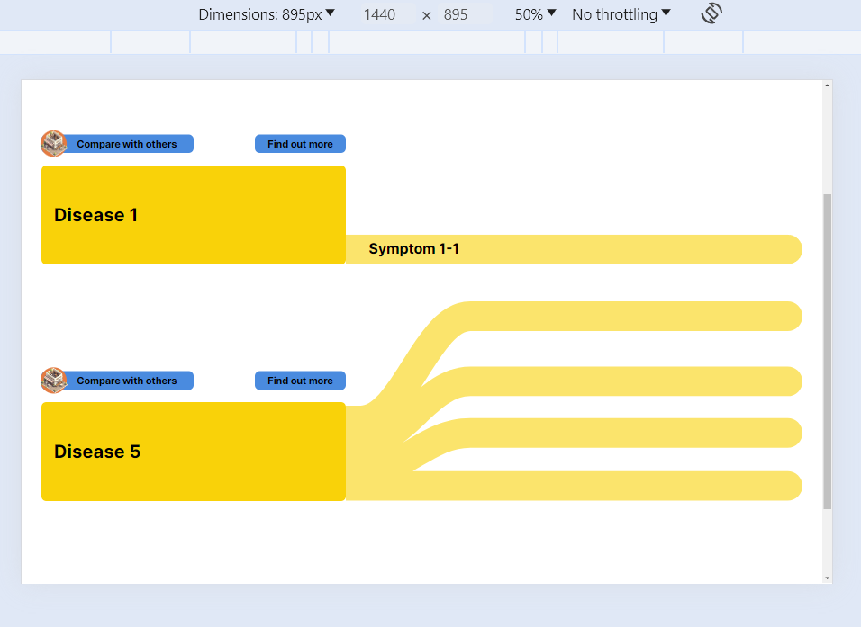
In the chrome developer tool if I set the device screen size to 1440px for example, everything is good:
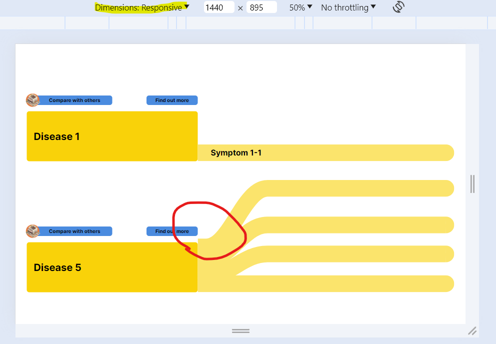
But when I try to see my website in the Responsive way, with the same width and height ( 1440px for example) the design becomes warped.
 .
.
So my question is: if a user with this screen size (1440px for example) see my web page , which one will be shown?

HTML 5 includes a handy tool for responsive design called
viewport. Try including<meta name="viewport" content="width=device-width, initial-scale=1.0">at the top of your HTML file. This will set the width of the page to the screen-width automatically. For more information on responsive design I recommend W3 School's tutorial. Additionally, I would recommend posting code samples with your question and avoiding the use of pictures when possible.